Snazzy looking website you’ve got there, Tim! I think your choice of color combination is interesting. Contrasting a stark white with deep purple is definitely really easy on the eyes. It looks professional without looking dull. The way you used bigger fonts to separate the navigation from the rest of the text on the website was also a good move. Your visitors will never have to search hard to know where they want to go next on your website.
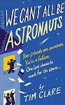
My first book, We Can't All Be Astronauts, is out now from Ebury Press. Buy it here.
About the Author
Tim Clare is a writer, stand-up poet and musician. His autobiographical book about having one last shot at your dreams, We Can’t All Be Astronauts, won Best Biography/Memoir at the East Anglian Book Awards 2009. It is out now from Ebury Press. He has written for the Guardian, the Times and the Independent, and has appeared on BBC2, Radio 1, 2, 4 and 6. In 2005 he presented the Channel 4 series ‘How To Get A Book Deal’. He is a regular performer at many festivals including Glastonbury, Leeds and Reading, and Latitude. To get We Can’t All Be Astronauts click here. To check out his latest gig schedule, click here. To get in touch, drop him a line at: joshureplied[at]yahoo[dot]co[dot]uk
 Want to see my new website? CLICK MY MASSIVE EYE! GO ON! CLICK IT!


http://23takes.blogspot.com/
ReplyDeleteIMPRESSIVE SITE! :D
Snazzy looking website you’ve got there, Tim! I think your choice of color combination is interesting. Contrasting a stark white with deep purple is definitely really easy on the eyes. It looks professional without looking dull. The way you used bigger fonts to separate the navigation from the rest of the text on the website was also a good move. Your visitors will never have to search hard to know where they want to go next on your website.
ReplyDelete- Emilia Loza -